Memory
Venus Paradise Regained
What I do remember was the factory itself, a Leger-like landscape of monstrous tubes and conveyor belts and the intense aroma of chocolate that blanketed the main production hall. (The Twinkies must have been made on a different shift). And, of course, the cupcakes themselves—straight off the conveyor belt, still warm enough that the characteristic seven squiggles of icing atop the cupcake hadn’t yet set and the cake inside was still gooey. Even though these still are being made, I can’t imagine any American grammar school class now going on a field trip devoted to learning about junk food. Judging from the incidence of child obesity in the United States, this kind of instruction is now being done at home.
I don’t know if these episodes of nostalgia come from spending more time with my four-year old godson or just getting older. About the latter I harbor no illusions; most of the toys of my childhood are now only available as collector items on e-bay. It’s just as well that I can’t easily buy back the objects of my childhood. I know that I cannot re-experience the delight and marvelous company that these toys and books and games of my childhood gave me as child. Don’t expect magic if you can’t eat a cupcake without thinking about fiber and saturated fat. There’s no going back to the playground. Even for a visit.
That said, I’m sad that they no longer make Venus Paradise color-by-numbers sets. They were extraordinary pencils. I remember their soft core (they didn’t break easily), the deep warmth of the colors, the smooth color laydown. When I think of these pencils now, I’m reminded of the rich saturated colors of a Douglas Sirk film or Todd Hayne’s stunningly beautiful homage to the director and his cinematography in Far from Heaven.
I don’t recall any of the scenes I penciled in, except for one with the Capitol building in Washington that I remember only because of the seemingly endless expanse of sky I needed to fill in. Even as a child I wasn’t patient with such repetitive tasks and much preferred coloring in the smaller shapes that would eventually reveal a face or flower.
The Venus pencils defined my sense of color as a child. Orange was always Sarasota orange. Red came in four shades—poppy red, Hollywood cerise, cherry red and Indian red—as did green: emerald green, deep chrome green, lawn green and French green. It was only years later that I figured out why they called it French. The shade resembled a chartreuse. Until this discovery, however, I just thought that springtime in France must be truly remarkable (the pencil was often used in coloring in gardens). There was also smoke grey and midnight black and a dozen other colors. Sky blue, of course.
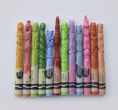
For me, each had a character of their own, like the astonishing figures of the Chinese zodiac that artist Diem Chau has carved out of Crayola crayons. The elongated, intricately animals— a yellow-green lion, an apricot ox, a green-yellow dragon and the others—look like delicate columns in a tiny temple. Ornate and richly expressive, they seem to draw character from the very color from which they are carved.
I wonder if the Venus Paradise pencils would have exercised the same kind of magic on Harry as they did on me. Of course, Harry’s too young for a color-by-numbers kit, but I’d have saved it for later. But the truth is I don’t really know if he’d have liked it. I’m always somewhat at a loss when it comes to buying presents for him. Though I’m fairly good at imagining how a friend lives and what he’d like as a present, I can’t do this Sichhineinversetzen with kids. They’re like another species to me.
I got him the next best thing to a Venus Paradise set and even easier. It was a box of crayons and a coloring book. The book featured a pair of similar drawings on facing pages, one colored in, the other with only the outline of the composite shapes. The images were simple but with just a twist of complexity to keep them interesting: a monkey in a bell-boy’s uniform, a snake with a long red-and-white barber-pole scarf, an ambulance with a big red cross emblazoned on its hood. My friend Dieter, who’s a teacher, had told me that kids his age could do things like copy a circle and make a cross and draw a man, so I figured that coloring in a cross would be easy.
I opened the book to the page with the image of the truck, took out the red crayon and slowly colored in part of the cross. I gave him the crayon so that he could complete the cross. He began with short strokes back and forth, which he quickly elongated however into sweeping zigzags that whizzed out of the cross, across the circle of white in which it was inscribed, and down the hood and then back. “Well, now that’s very pretty. We’ll do the tires, now, ok?” and handed him the grey crayon. “But let’s try to keep within the lines.” Harry repeated his centrifugal zigzags, but describing a more modest arc. Progress, I thought.
He moved onto the ambulance driver. He did a bit of the man’s jacket and then, pointing to the driver’s face asked, “What’s this color?” “It’s flesh,” I said, “we don’t have this color.” Venus Paradise did. #14 natural flesh. Crayola surely had it, too, but in the big box of 64, I imagine. “Maybe you could use orange,” I said. “I promise, next time I come, I’ll bring more colors.”
I didn’t bring more crayons the next time I came, but I brought more colors. I thought maybe he’d be bored with more crayons. (Dieter later told me I needn’t have worried; kids, he said, were more comfortable with repetition than we are.) I brought finger-paints instead and a big block of paper. I had hoped Harry would draw a sun or a stick tree or even a simple cross, but instead he covered the page with swathes of thick color. Admittedly with a good deal of gestural vibrancy, but there was no figure.
But he liked dipping his fingers in the paint and swiping it across the page. Maybe it was just the pleasure of getting messy, but he seemed genuinely intrigued by the colors that emerged when we mixed paints in the plastic bowls. We gave them names. Lemon yellow and cherry red and navy blue, though I had to explain what the navy is.
The day I bought Harry the finger paints I also stopped by the men’s department. Buying clothes for me is like grocery shopping. I tend to buy whatever I’m running low on, and often in quantity, and I usually resort to the utilitarian and monochrome. My friend Jonas, who’s the personification of understated sartorial elegance, says I dress as if I were living in a black-and-white movie. A black-and-grey movie, to be more precise. He says there’s a reason why the shades of grey— the greys of ash and lead, of charcoal and slate—are all cold and somber and that I need to add some color to my life. I told him I had.
The following is a near complete color list of the Venus Paradise pencils, put together by a member of the online Wet Canvas community:
1. Deep Yellow
2. Sarasota Orange
3. Poppy Red
4. Hollywood Cerise
5. Orchid Purple
6. Navy Blue
7. Peacock Blue
8. Emerald Green
9. Deep Chrome Green
10. Photo Brown
11. Chestnut Brown
12. Midnight Black
13. Ultramarine Blue
14. Natural Flesh
15. Lawn Green
16. French Green
17. Smoke Gray
18. Blush Pink
19. Cherry Red
20. Arizona Topaz
21. Indian Red
22. Sky Magenta
23. Cotton White
24. Lemon Yellow
25. ?
26. ?
27. Sky Blue
Image: Diem Chu, Zodiac Crayons

Venus Paradise pencil # 25 was “antique gold” and # 26 was “bright silver”. I don’t think these two pencils were ever included in the sets, but were sold separately. FYI, I will be putting an unsharpened # 26 on eBay shortly, under eBay seller “sdmonster”.
LikeLike
Thanks for the information!
LikeLike
I remember that VP pencils also had a very DEEP Royal purple…(back in the Eisenhower era), that was unique in that it was true purple without an undertone. My other favs were FRENCH GREEN, EMERALD GREEN and ULTRAMARINE. The reason I remember so well, is that I was in bed with mumps. It was 1959, and given a choice between colouring and Eisenhower, I chose my Venus Paradise set. What I wouldn’t give for a 12 pencil set of each of those four colours.
They’re almost impossible to duplicate, unless you overlay with an art marker….or two or three.
LikeLike
I miss Veunus Paradise pencils so much!! They need to bring them back!!
LikeLike
Thanks for helping out on the last two numbers. I seem to vaguely recall Silver, but I can’t for the life of me remember coloring in with Gold. But maybe it wasn’t used much in the sets. Which I suppose would make sense for the color of a rare metal.
LikeLike
Believe the Venus Paradise numbers 25 and 26 may have been Silver and Gold. I remember all the qualities that sxchristopher lays out above. I used to order replacement pencils direct from the factory in 12-packs per color. Thought I had enough stocked to last me, but alas, after taking a 20-year break from drawing to raise a family, I ruefully also discovered they were no more. Now I’m relegated to prowling the web looking for scraps to buy.
LikeLike
Thanks for the comment! I wish you good luck on your search for an original set… if you do find it, let me know what colors were pencil #s 25 and 26 🙂
The artist who does the sculptured crayons is Diem Chau. She’s a Vietnamese woman who now lives and works in the States. Her work often plays on themes of memory and storytelling. More at http://diemchau.com/default.html
LikeLike
I think my friend Pat is just as crazy nostalgic for the Venus Paradise past as you seem to be. I’m currently stalking an unused one on Ebay for her that doesn’t go up to $100. That’s the tricky part, it seems. Liked your post, but would like more info on the pic you posted. I’m assuming it’s an artist’s (or rather, sculptor’s) project or commentary. Wild. Thanks for posting it.
LikeLike